Make a data presentation accessible to nontechnical readers
In this article (7 sections)
Make a data presentation accessible by giving readers a clear question, familiar wording, visible units and more than one way to understand the evidence. Explain the decision consequence without requiring the audience to decode a model, legend or statistical term before they know why it matters.
Accessibility also includes people using assistive technology or small screens. Plain language helps, but it does not replace text alternatives, readable layouts and usable interactions.
Lead with the question and the result
For the original availability case, begin with: “Does the evidence establish a stockout share above 30%?” Then answer: “Not yet; two of eight expected states are unknown, and the possible full-grid share runs from 25% to 50%.”
This gives the reader the task and conclusion before the calculation. Explain the numerator and denominator next, using the source counts rather than introducing jargon first.
The uncertainty chart article provides the figure, underlying counts and text interpretation. Its range is a missing-data bound, not a confidence interval.
Pair the visual with a concise text equivalent
W3C's complex-image guidance describes text alternatives and fuller descriptions for charts and diagrams. A short alternative should identify the important content; surrounding text or a data table can provide the detail needed to understand the comparison.
For the availability figure, a useful description includes the 25–50% bounds, the 30% threshold and the fact that two states are unknown. “Stockout chart” does not communicate the analytical result.
Do not make the image the only place where a key limitation appears. Readers may encounter the content through a screen reader, a copied excerpt or a view where the image is unavailable.
Use labels that preserve meaning
Write “completed orders” instead of an unexplained abbreviation. State whether amounts are rupees or paise. Distinguish a percentage-point change from a relative percentage change.
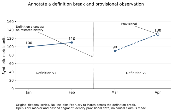
Use direct labels where they improve comparison and explain any necessary legend. Color should reinforce meaning rather than carry it alone. The annotation figure uses an open marker and dashed segment for provisional data, plus written labels.
Keep terms consistent across the title, chart, table and spoken explanation. Switching between “sales,” “revenue” and “cash” can create a meaning change that a nontechnical reader has no reason to suspect.
Reduce cognitive load without removing evidence
Show one main comparison at a time. Place the relevant denominator and caveat near the result rather than in a distant appendix. Use a small table when exact values matter more than a visual pattern.
Avoid unnecessary decimal places. Precision should reflect the calculation and decision, not make a small synthetic example appear more authoritative. Retain enough detail to avoid changing a threshold classification through rounding.
If a statistical term is necessary, explain its role in the decision. For example, say that an interval includes both a small negative and a positive difference before expecting the reader to interpret a technical label alone.
Check the actual reading environment
Review the presentation on a small screen, at increased zoom and in the export format readers will receive. Check for clipped labels, horizontal scrolling, tiny annotations and interactions that require hovering.
The local review library's chart articles were checked at representative desktop and mobile widths. Scaled mobile figures still benefit from full-size SVG links and equivalent body text. That check is not a complete accessibility audit or a claim that every presentation format is covered.
For interactive dashboards, also test keyboard access and whether the same information is available without color or a mouse. Match the verification to the actual product rather than assuming a readable screenshot proves accessible interaction.
Ask readers to explain the takeaway
Have a non-specialist state the main result, limitation and next action in their own words. If their interpretation differs from the evidence, revise the presentation rather than blaming their lack of technical knowledge.
Exercise: rewrite one chart caption so it includes the question, result and decision-changing limitation in three short sentences. Provide a table or description that preserves the essential information without the image.
NeuraPath's Data Analytics with Generative AI course connects visualization with clear business communication. A useful presentation makes the evidence understandable and available to the people who need to act on it.
Continue learning
This article is part of the Metrics, visualization and decision communication sequence. Use the neighbouring tasks when you need the prerequisite or the next application.
- Review the prerequisite or neighbouring task in Build a chart annotation standard for recurring reports.
- Continue with Review an analysis for confirmation bias.
Pankit Kumar has 10 years in Data Science & AI, building and shipping production systems in regulated pharma and clinical environments. He is a freelance trainer at Boston Institute of Analytics, AnalytixLabs and Scaler, and has taught this material to thousands of working professionals.
This article is part of our Data Analytics with Generative AI programme — 3–4 months. The full analyst stack — Excel, SQL, Power BI and Python pipelines — then a generative-AI layer you can prove is right.
Explore Data Analytics with Generative AI