Show uncertainty in a management chart
In this article (7 sections)
Show uncertainty in a management chart when it can change the decision. Label the type of uncertainty and the population it concerns. A range is useful only if the reader knows whether it represents sampling uncertainty, prediction uncertainty, scenario assumptions or missing data.
This original figure shows missing-state bounds for a synthetic retail availability report. It is not a confidence interval.
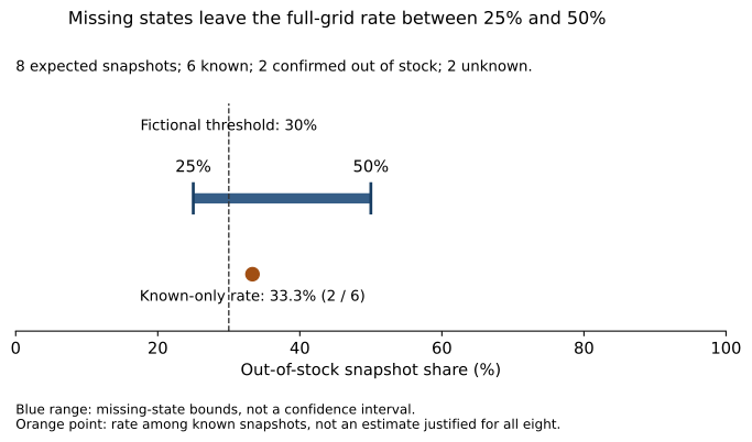
Open the full-size SVG for zooming. All counts, bounds and the decision consequence are explained in text below.
Begin with the expected population
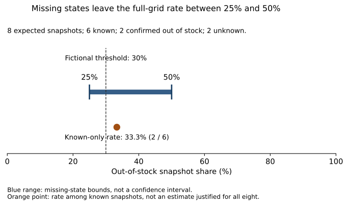
The case expects eight product-day snapshots. Six have known availability, two are confirmed out of stock and two are unknown. The observed rate among known states is two divided by six, or 33.3%.
For the full eight-cell grid, the lowest possible share is two divided by eight, or 25%, if both unknown states are in stock. The highest is four divided by eight, or 50%, if both are out of stock.
The availability capstone defines the grid independently of received rows. That prevents a missing observation from disappearing from the denominator.
Reproduce the values behind the figure
import importlib.util
from pathlib import Path

path = Path('../domain-operations/capstone.py')
spec = importlib.util.spec_from_file_location('chart_availability',path)
module = importlib.util.module_from_spec(spec)
spec.loader.exec_module(module)
result = module.analyze(module.read_rows())
assert result['scheduled_snapshots']==8
assert result['known_snapshots']==6 and result['unknown_snapshots']==2
assert result['observed_stockouts']==2
assert (result['all_snapshot_lower_bound'],result['all_snapshot_upper_bound'])==(.25,.5)
assert result['coverage']==.75
threshold = .30
assert result['all_snapshot_lower_bound']<threshold<result['all_snapshot_upper_bound']
print({'bounds_percent':[25,50],'coverage_percent':75,
       'threshold_classification':'unresolved'})
The figure renderer uses the same capstone calculation. It produces exportable SVG and PNG files, with the input counts and interpretation recorded alongside them.
Make the decision consequence visible
The fictional threshold is 30%. The possible full-grid share crosses it, so the supplied states do not establish whether the rate is above or below the threshold.
The separate 33.3% point is labeled as the rate among known snapshots. It is not placed at the center of the range or presented as an automatically justified estimate for all eight states.
That distinction prevents the chart from implying more knowledge than the data provides. Using 33.3% for the full population would require an assumption about how the unknown states relate to the known ones.
Explain the range in ordinary language
A suitable caption is: “Two of eight expected states are unknown. Depending on those states, the full-grid stockout share is between 25% and 50%; the available data does not settle the 30% threshold classification.”
The Government Analysis Function's uncertainty guidance emphasizes clear communication of quality and limitations. Here the original calculation makes that principle concrete by showing how missing information changes the possible decision.
Do not label the endpoints “95% confidence” or imply equal probability across the range. No probability model for the missing states has been supplied.
Keep uncertainty and operational severity distinct
An unresolved threshold classification does not mean there is no issue. Two stockout snapshots are confirmed and can be investigated. It also does not identify lost demand, stockout duration or the financial value of an intervention.
State what additional evidence is needed: recover the two missing states, then assess whether the chosen threshold and action fit the operational context. If the decision must be made earlier, make the assumptions and trade-offs explicit.
Provide a text route to the result
Include the counts, bounds and decision consequence in the surrounding text, as this article does. The plot's colors are supplementary; labels, marker shapes and the written explanation carry the meaning.
Exercise: confirm one unknown state as in stock and recompute the upper bound. Then confirm it as out of stock in a separate scenario. Explain how each update changes the threshold decision without changing the expected eight-cell grid.
NeuraPath's Data Analytics with Generative AI course connects uncertainty reasoning with visualization. The goal is to help a manager see which conclusions are stable and which depend on information the report does not yet contain.
Continue learning
This article is part of the Metrics, visualization and decision communication sequence. Use the neighbouring tasks when you need the prerequisite or the next application.
- Review the prerequisite or neighbouring task in Avoid misleading axes in business reporting.
- Continue with Build a one-page analytical decision memo.
Pankit Kumar has 10 years in Data Science & AI, building and shipping production systems in regulated pharma and clinical environments. He is a freelance trainer at Boston Institute of Analytics, AnalytixLabs and Scaler, and has taught this material to thousands of working professionals.
This article is part of our Data Analytics with Generative AI programme — 3–4 months. The full analyst stack — Excel, SQL, Power BI and Python pipelines — then a generative-AI layer you can prove is right.
Explore Data Analytics with Generative AI