Build a chart annotation standard for recurring reports
In this article (7 sections)
A chart annotation standard should identify events that change how a reader interprets the data: definition changes, missing observations, provisional values, revisions and relevant operating context. Use consistent wording and visual treatment so readers do not have to rediscover the meaning of a symbol every month.
Annotations should explain evidence, not decorate the chart or turn coincident events into causal claims.
Start with a concrete example
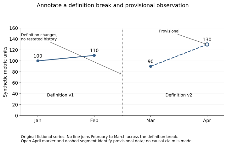
The original fictional series below contains values of 100, 110, 90 and 130. The metric definition changes between February and March, and April is provisional. No restated history is available.
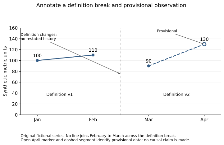
Open the full-size SVG for zooming. The values and status are also available in the table below.
| Month | Value | Definition | Status |
|---|---|---|---|
| January | 100 | v1 | Final |
| February | 110 | v1 | Final |
| March | 90 | v2 | Final |
| April | 130 | v2 | Provisional |
The source CSV and renderer reproduce the figure. It is a teaching artifact, not an observed business trend.
Define annotation types and their meaning
Use a definition-break note when the measure changes and comparable history is unavailable. Use a provisional marker when the value may change under a stated completion or revision process. Use a missing-data note when an absent observation would otherwise be mistaken for zero or continuity.
An operating-event annotation, such as a campaign launch, provides context. It does not establish that the event caused a movement in the series. Keep the wording descriptive unless the causal claim has separate supporting evidence.
ONS axis and chart guidance provides context for preserving interpretable scales. The annotation standard here is an original practical proposal built around the supplied figure.
Preserve the break visually
The chart does not connect February to March. A vertical separator and definition labels reinforce the fact that a direct change calculation across that boundary is not justified by a common definition.
April uses an open marker and dashed segment, with the word “Provisional.” These cues avoid relying only on color. The annotation sits near the relevant point and the caption repeats its meaning.
If comparable history is later restated, publish the revised series with a version note. Do not simply remove the break without explaining why the historical values or comparability changed.
Keep annotation records with the data
Store the affected period, annotation type, concise text, source reference and current status in a small metadata table. In a real workflow, identify who can approve changes and when a provisional label should be reviewed.
This makes recurring chart generation more dependable than manually placing text boxes after every refresh. It also helps ensure that exports and alternative text preserve the same interpretation.
Do not let stale annotations survive indefinitely. A provisional marker should reflect the current data status, while a historical definition change may remain relevant permanently.
Review readability and information priority
Use concise annotations near the affected data and avoid covering values or axis labels. If the chart becomes crowded, move supporting detail into a caption or accompanying table while retaining the essential warning.
W3C's complex-image guidance explains the need for text descriptions that convey important chart information. Include annotation meaning in that text, not only inside the image.
Test the standard on a changed report
Add a missing month, revise a prior value or change the definition in a copy of the fixture. Check whether the annotation system makes each situation distinguishable from an actual zero or ordinary month-to-month movement.
Exercise: write an annotation for a source correction that changes February from 110 to 108. State whether the correction changes the metric definition or only the value, and explain how the report version should record it.
NeuraPath's Data Analytics with Generative AI course connects chart design with reporting maintenance. Consistent annotations help recurring reports preserve their meaning as data and definitions evolve.
Continue learning
This article is part of the Metrics, visualization and decision communication sequence. Use the neighbouring tasks when you need the prerequisite or the next application.
- Review the prerequisite or neighbouring task in Explain why two correct reports can disagree.
- Continue with Make a data presentation accessible to nontechnical readers.
Pankit Kumar has 10 years in Data Science & AI, building and shipping production systems in regulated pharma and clinical environments. He is a freelance trainer at Boston Institute of Analytics, AnalytixLabs and Scaler, and has taught this material to thousands of working professionals.
This article is part of our Data Analytics with Generative AI programme — 3–4 months. The full analyst stack — Excel, SQL, Power BI and Python pipelines — then a generative-AI layer you can prove is right.
Explore Data Analytics with Generative AI