Avoid misleading axes in business reporting
In this article (6 sections)
For an ordinary bar chart, use a zero numerical baseline so bar lengths represent the values being compared. Truncating the axis can make a small change look much larger even when the labels are numerically correct.
The original figure below uses the same two synthetic counts in both panels: 95 and 100 completed orders. The lower panel is intentionally misleading and labeled as a teaching example.
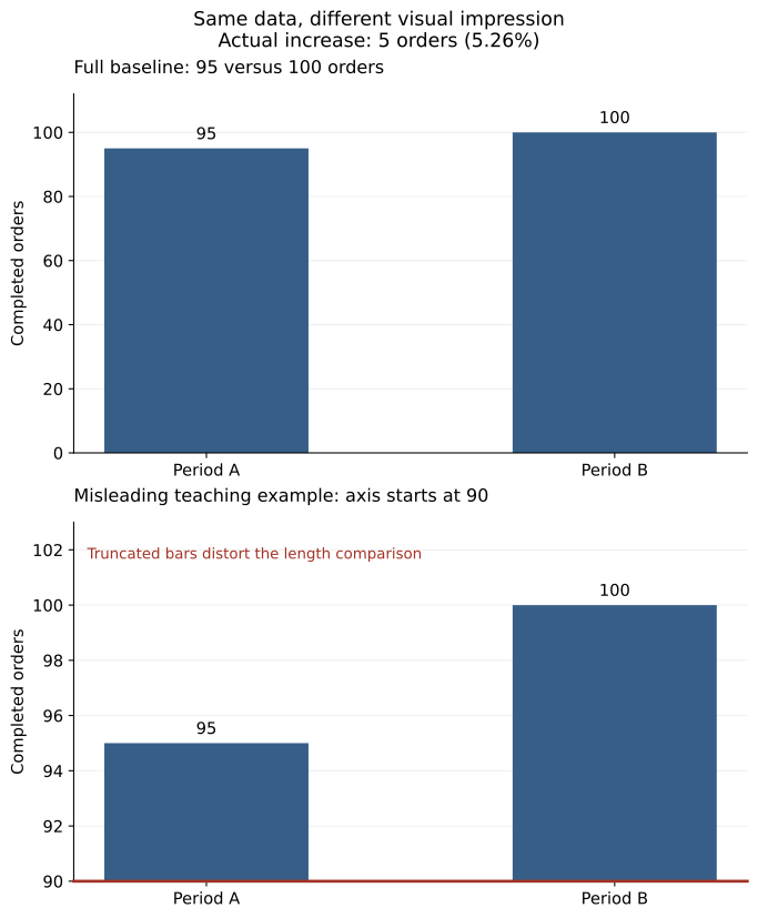
Open the full-size SVG for zooming. The source values and comparison are also given in text below.
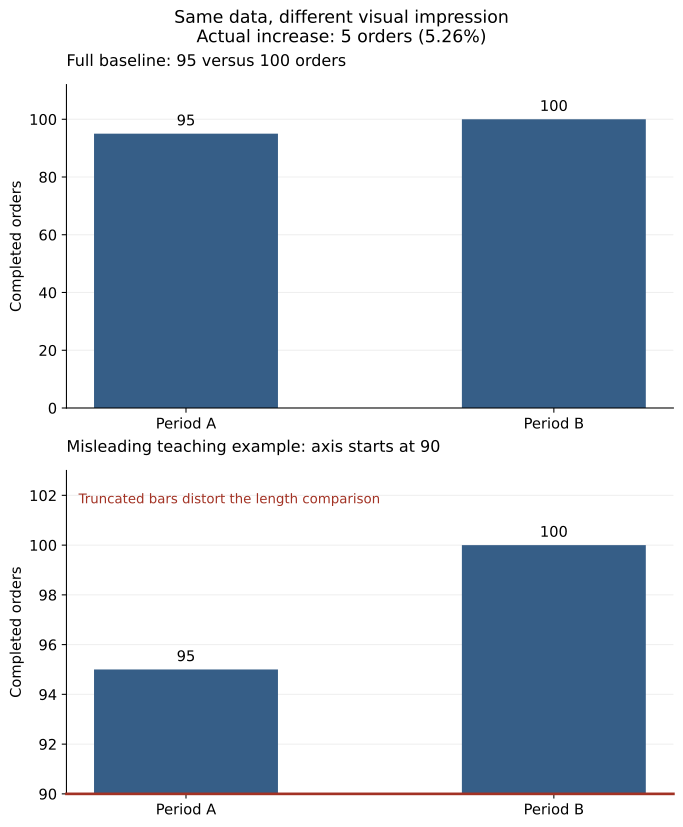
Compare the values with the visible lengths
The actual increase is five orders. Relative to 95, that is approximately 5.26%. In the truncated panel, the visible portions above 90 have lengths five and ten, so one appears twice as long as the other.
That two-to-one visible-length ratio is not the ratio of 100 to 95. The chart's encoding creates an impression that the printed values do not justify.
from fractions import Fraction

before,after = 95,100
actual_ratio = Fraction(after,before)
actual_growth = Fraction(after-before,before)
truncated_visible_ratio = Fraction(after-90,before-90)
assert actual_ratio==Fraction(20,19)
assert actual_growth==Fraction(1,19)
assert truncated_visible_ratio==2
print({'actual_growth_percent':float(actual_growth)*100,
       'actual_value_ratio':float(actual_ratio),
       'truncated_visible_length_ratio':float(truncated_visible_ratio)})
The source CSV and renderer reproduce both SVG and PNG versions. The data is invented for the explanation and does not represent business performance.
Choose a display suited to a small difference
If the full-baseline bars make the difference difficult to inspect, show exact labels or use a suitable alternative such as a dot plot with a clearly labeled scale. You can also report the difference directly: five orders, or 5.26% of the initial count.
ONS axis guidance explains why charts encoding values through filled lengths or areas need a zero baseline. The issue is the visual encoding, not a rule that every possible chart must always begin at zero.
A line chart showing variation within a narrow range may use a restricted axis when that choice is clear and appropriate. Review whether the scale exaggerates the practical significance, and preserve context in the caption and labels.
Keep comparison panels consistent
When two panels invite comparison, check whether they use the same units and scale. Separate auto-scaled panels can make very different magnitudes look similar or similar variation look different.
If different scales are necessary, label them prominently and explain why. Do not rely on the reader noticing a small axis tick while the title encourages a direct comparison.
The two panels in this teaching figure deliberately use different scales to expose the distortion. They should not be reused as a normal performance dashboard without that explanation.
Inspect other axis choices
Check the time spacing, order of categories, logarithmic transformations and any secondary axis. A logarithmic scale can be useful for multiplicative comparisons, but readers need to know how to interpret equal distances on it.
Dual axes can make unrelated series appear to move together through scale choices. If the business question is whether two variables relate, inspect the underlying paired values and consider a display that makes the relationship explicit rather than depending on overlapping lines.
Make the exact comparison available
The underlying values are simple:
| Period | Completed orders |
|---|---|
| A | 95 |
| B | 100 |
Keep this information and the interpretation available in text so the figure is not the only route to understanding the result. Label the unit as orders, not currency or a percentage.
Exercise: change the fictional counts to 195 and 200. Calculate the actual percentage increase and explain why choosing a baseline of 190 would again produce a misleading two-to-one visible-length comparison.
NeuraPath's Data Analytics with Generative AI course links chart design with numerical reasoning. A well-designed axis helps the reader see the difference at its proper scale rather than merely making the chart more dramatic.
Continue learning
This article is part of the Metrics, visualization and decision communication sequence. Use the neighbouring tasks when you need the prerequisite or the next application.
- Review the prerequisite or neighbouring task in Choose a chart from the comparison the reader needs.
- Continue with Show uncertainty in a management chart.
Pankit Kumar has 10 years in Data Science & AI, building and shipping production systems in regulated pharma and clinical environments. He is a freelance trainer at Boston Institute of Analytics, AnalytixLabs and Scaler, and has taught this material to thousands of working professionals.
This article is part of our Data Analytics with Generative AI programme — 3–4 months. The full analyst stack — Excel, SQL, Power BI and Python pipelines — then a generative-AI layer you can prove is right.
Explore Data Analytics with Generative AI